
The genogram maps backwards. The ecomap maps outwards.
A genogram is unmatched at showing structure and history: who relates to whom across generations, and which patterns repeat. What it does not show is the world the family lives in right now. A household can look identical on paper and be living two completely different lives, one held up by work, school, neighbours and a church, the other holding on with almost nothing around it.
The ecomap is the diagram for that second question. The household goes in a circle at the centre, the systems it touches go in circles around it, and the lines between them show what each connection is like and which way it runs. Ann Hartman published it alongside the genogram in 1978, describing the two as "two simple paper-and-pencil simulations" (Hartman, 1978, p. 467).
Where it came from, and who made it
Ann Hartman developed the ecomap in 1975, at the University of Michigan School of Social Work, as part of the federally funded Child Welfare Learning Laboratory. Its first job was practical: helping public child welfare workers "examine the needs of families" (Hartman, 1978, p. 467). It was tested extensively with parents working toward the return of children in foster care.
Two details from that origin tend to get lost, and both matter.
The first is that the ecomap began as a thinking tool for the worker, not a joint exercise. Hartman is explicit that it was developed to help organise material and form an assessment, and that its collaborative use came later, by discovery: "before long, it became apparent that the eco-map would make a useful interviewing tool" (Hartman, 1978, p. 469).
The second is what happened when it was used that way. Hartman describes worker and client moving to sit "shoulder-to-shoulder, working together on the joint project", and reports that in foster care work, parents who were "generally angry and self-protective following placement of their children" were "almost without exception engaged through the use of the map" (Hartman, 1978, p. 471). Her explanation is that the ecological framing made it clear the worker "was not searching for their inner defects" but was interested in what it was like to be in the client's space.
The systems thinking behind the picture
The ecomap looks simple, and that is deceptive. Its logic comes from general systems theory, and knowing the four ideas underneath it changes what you see on the page.
The family is an open system. General systems theory distinguishes systems that exchange energy, matter and information with their environment from those that do not (von Bertalanffy, 1968). A household is unavoidably open: it takes in wages, schooling, care and company, and it sends out labour, attention and money. An ecomap is a picture of that exchange, which is why it is drawn as a centre surrounded by everything it trades with.
The circle is a boundary, and boundaries have permeability. Where the household ends and the world begins is a real clinical question, not a drafting decision. A boundary crossed by many varied lines belongs to a family in traffic with its surroundings. One crossed by two thin lines belongs to a family that has closed, or been closed off.
Arrows are input and output. Systems sustain themselves by importing more than they expend; a system that only exports runs down. Hartman's drained father, looking at a map where every arrow pointed outwards, had read exactly that off the page without needing the vocabulary for it. The arrows are the part of the notation that carries the systems theory most directly.
The outer circles are the suprasystem. A family is a system made of subsystems and nested inside larger ones. Mello et al. (2005) describe the ecomap in exactly these terms, as a representation of the family's relations "com o supra-sistema". The genogram looks downwards into the family's internal structure; the ecomap looks upwards at its position within the larger whole. That is the cleanest statement of why the two diagrams do not compete.
It is worth being precise about intellectual lineage here. Hartman situates the tool in the ecological perspective that was reshaping social work in the 1970s, the same current that produced Bronfenbrenner's ecological framing of human development (1979). The ecomap is a product of that moment rather than an application of any single author's model, and Hartman presents it as a practice instrument, not a theoretical statement.
What the lines actually mean
Hartman's notation is compact. In her own words, "a solid or thick line represents an important or strong connection and a dotted line a tenuous connection; jagged marks across the line represent a stressful or conflicted relationship," and it "is useful to indicate the direction of the flow of resources, energy, or interest by drawing arrows along the connecting-lines" (Hartman, 1978, p. 468).
So the core code is three line types plus arrows. Strength and direction are separate questions: a connection can be strong and draining, or weak and nourishing.
Two things are worth correcting, because both circulate widely online.
The first is the idea that the number of parallel lines encodes how strong a bond is. A line-count convention genuinely exists in the literature: Mello et al. (2005) describe it for the genogram, where one connecting line marks a strong relationship between two family members and two lines a very strong one, and Borges Gomes and Dalla Vecchia (2023) describe the ecomap as using "linhas simples, duplas, triplas ou tracejadas" for the ties between a person and their environment.
What matters is that this is not Hartman's notation. Her paper contains no multi-line gradient at all; strength is carried by weight and style, not by counting lines. So two conventions are in circulation, and a reader trained on one will misread the other. Which tradition a given diagram follows is worth stating on the diagram itself rather than assuming.
The second is more interesting. Hartman qualified her own code in the same paragraph she introduced it. In testing, the three line types worked well when a worker used the map alone as an analytic tool, but with clients "this code has often been felt to be too constraining. Workers have preferred to ask clients to describe the nature of the connection and will then qualify that connection by writing a brief description along the connecting line" (Hartman, 1978, p. 468). Her own worked example uses exactly that: a line to the extended family annotated "demanding, ill, needs financial and emotional support".
In other words, writing plain words on the line is not a beginner's shortcut. It is the original author's documented alternative, and the one practitioners preferred in front of clients.
One useful addition from the German-language tradition
Hartman's notation has no symbol for something the family needs and does not have. A missing support simply is not on the map, which makes it indistinguishable from a support nobody thought to mention.
German-language social work fills that gap. In the self-administered ecomap form presented by Pantucek (2005), adapted from Hepworth, Rooney and Larsen, the client is asked to draw a plain line to each circle representing a strong positive relationship, a dashed line to circles representing burdensome situations, and then a wavy line to every circle they would need but that is not currently available to them.
Two cautions if you borrow it. That tradition uses dashed lines for burdensome rather than tenuous, so the same visual means different things in the two systems, and you should say on the map which convention you are using. It also centres an individual rather than a household. Worth noting too that Pantucek is candid about the instrument's limits, describing the ecomap as a coarse tool next to the more granular German Netzwerkkarte.
How to read one
Hartman modelled two readings that are still how most clinicians approach a finished map.
Emptiness reads as isolation. "An almost empty eco-map helps the client objectify and share loneliness and isolation" (Hartman, 1978, p. 471).
Outbound arrows read as depletion. She describes a map full of stressful relationships with every arrow pointing away from the family, prompting a father to say: "No wonder I feel drained, everything is going out and nothing is coming in!" (Hartman, 1978, p. 471).
One caveat from the current literature: a dense map is not proof of a supported family. A recent review of eco-mapping in health services research concluded that the support shown on a map "does not guarantee the provision of support", and that much of the value lies in the conversation required to draw it (Saragosa et al., 2024).
Drawing an ecomap in WebGeno
WebGeno does not have a dedicated ecomap mode. It does have the pieces an ecomap needs, and they combine into something close to Hartman's form: group boxes for the circles, nodes as the points those circles hold, and relationship lines for the connections.
The move that makes it work is using a group for every circle, including each system, even when the group contains a single element. Hartman's diagram is a circle surrounded by circles, and groups are the only thing in WebGeno that draws a labelled boundary around something. Use them for the household and the systems alike, and the two read as the same kind of object, which is exactly what the notation intends.
Four passes, shown below exactly as they appear in the app. Structure first, meaning last.
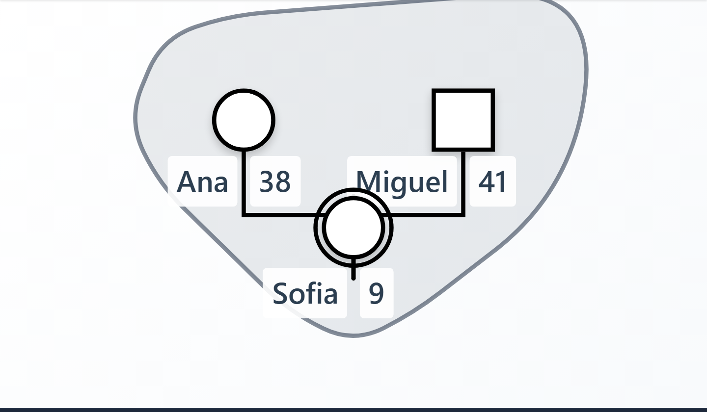
1. Group the household
Build the household members as you normally would, select them, and create a group. Name it "Household". That box is your central circle: inside it is the family system, outside it is environment.
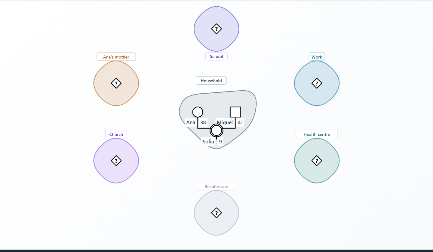
2. Give every system its own group
For each part of the environment that matters, add a single node and put it in a group of its own, named for the system: School, Work, Health centre, Ana's mother, Church, Respite care.
The group label carries the institution's name, which means the node inside does not have to. Leave its name blank and hide its labels, and it becomes what it actually is: an anchor point for the lines to attach to. Setting its gender to unknown keeps it from asserting a gender the institution does not have, at the cost of a small question mark inside the symbol.
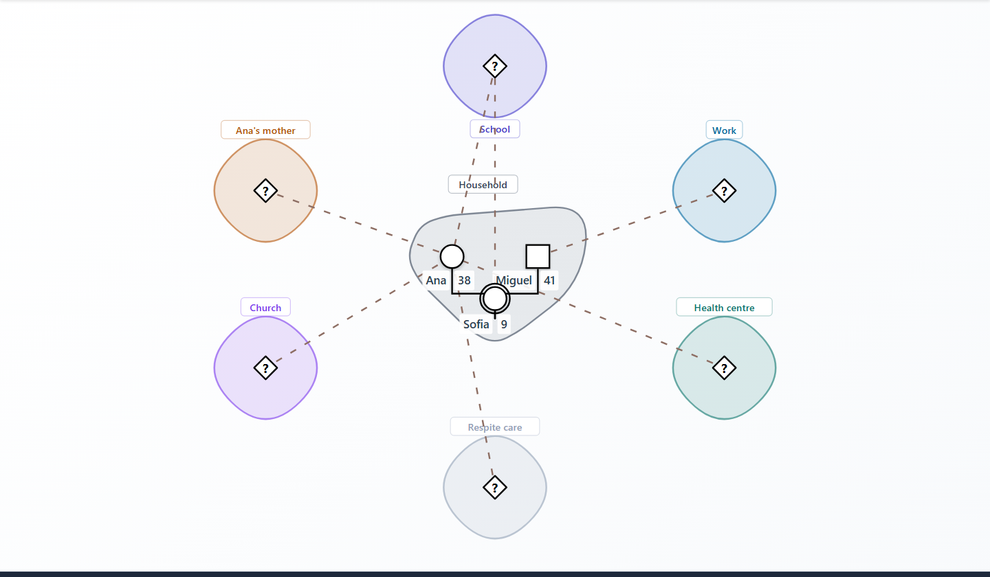
3. Connect the systems to the people
Draw relationship lines from each system's anchor node to the household member it concerns. Because lines attach to people rather than to boxes, you get the part of Hartman's design most tools lose: the same system can relate differently to two members of the same household, and the map shows it.
That is not a technicality. Hartman drew per-person connections precisely so a map could show "the contrasts in the way various family members are connected to the world" (Hartman, 1978, p. 469). A strong line from the school to the child and a stressful one from the school to the mother is a whole clinical picture in two strokes. For a connection that genuinely belongs to the household as a whole, draw it to whichever member represents the family in that domain, and say so in the line's description.
4. Give each line its meaning
Finally, style the connections. WebGeno's custom relationship types let you define a line by style, width, overlay and arrowheads, which happens to be exactly the vocabulary Hartman's notation needs.
| Ecomap notation | Meaning | Custom relationship type settings |
|---|---|---|
| Thick solid line | Strong, important connection | Line style solid, width thick |
| Dotted line | Tenuous connection | Line style dotted, width thin |
| Jagged line | Stressful or conflicted | Overlay zigzag |
| Wavy line | Needed but not available | Overlay wave |
| Arrowhead | Direction resources flow | Arrowhead filled, direction end or both |
Name each type in plain language ("Needed, not available") rather than in code, and use the description field on individual lines. Writing on the line is Hartman's own documented alternative to the symbol code, and it survives contact with a client better than a legend does.
Custom relationship types are a Professional feature, and you can define up to ten, which is more than an ecomap needs. On the free plan you can approximate the same readings with built-in types: a harmonious or close line for a strong tie, a distant one for a tenuous tie, and a conflict line for a stressful one.
Open the worked example.
This exact map is built into WebGeno. One click opens the fictional household above, already grouped, connected and styled, including the wavy line for the respite care it does not have. Take it apart, or save a copy and start your own.
Open the ecomap example →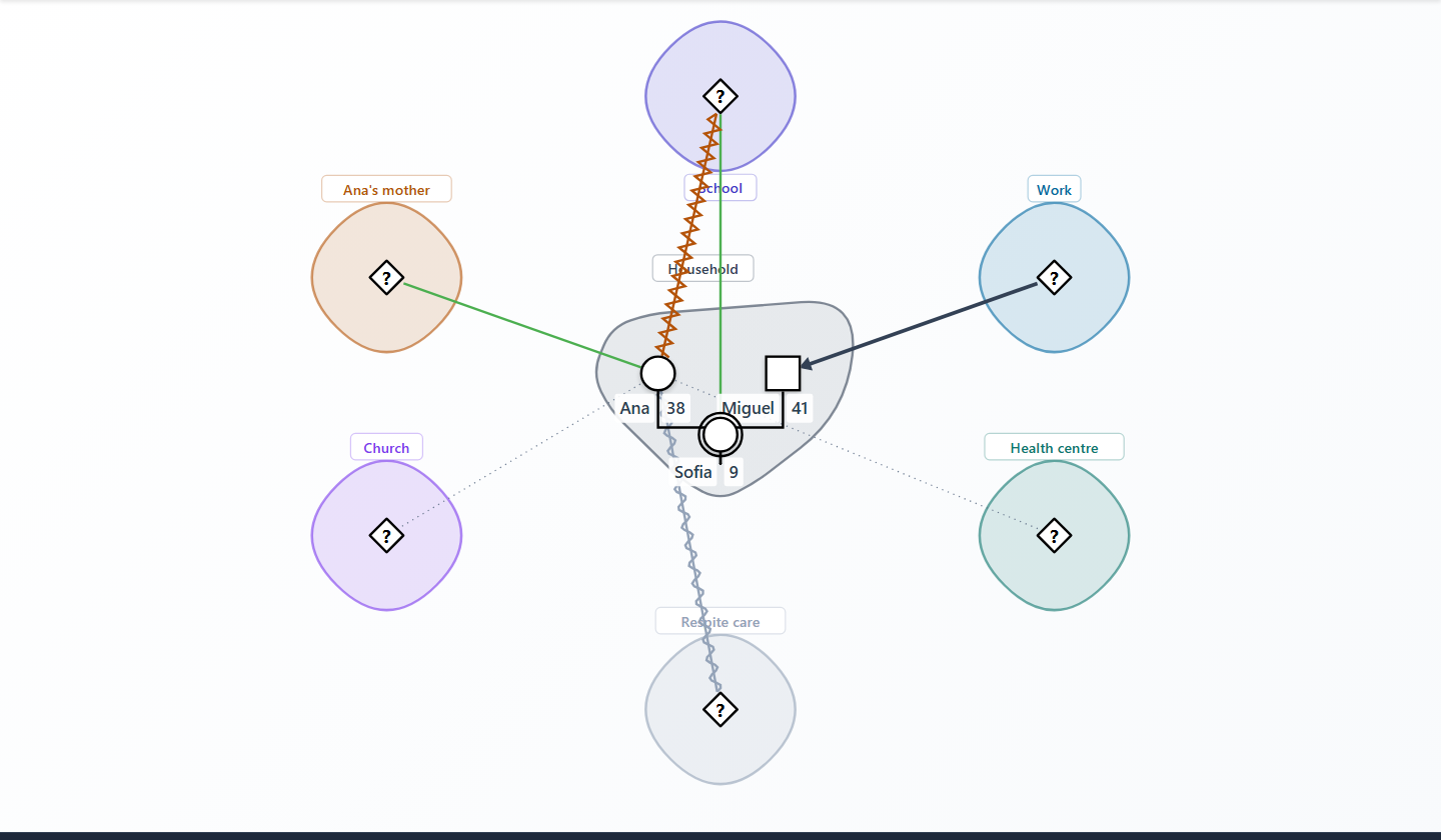
What this approach does not give you
Worth being straight about the seams, most of which are visible in the screenshots above. The anchor nodes are person symbols standing in for institutions, and an unknown-gender node draws a question mark inside its diamond. Group boxes wrap their contents rather than drawing true circles, so a household of three reads as a rounded blob rather than Hartman's neat circle. Group labels sit at the centre of the box by default, which means a single-node system needs its label nudged clear. A connection belonging to the household as a whole has to be drawn to one member as a stand-in. And nothing in the file knows it is an ecomap, so the app will not stop you drawing something the notation would not allow.
In exchange you get the household boundary, the full line vocabulary including the wavy line, per-person connections, and everything else WebGeno already does with the same file: undo, encryption, export and sharing. For a working document that is a fair trade, and it is a good deal closer to Hartman's design than a diagram tool with an ecomap template.
Where ecomaps are used today
The ecomap never acquired a single agreed notation the way genogram symbols eventually did. Adaptation is the norm: reviewing 73 studies, Manja et al. (2021) found that "researchers have adapted the ecomap to meet their health research needs", and the protocol for the later health services review describes the field as "heterogenous in its purpose, methodology and reporting" (Saragosa et al., 2023). Born in social work, it has since developed a substantial second life as a research instrument, used to elicit accounts of social support rather than to measure them (Rempel et al., 2007; Manja et al., 2021).
That research literature is also candid about the costs. Manja et al. (2021) list the additional time and training an ecomap takes to complete, and "potential privacy and confidentiality concerns", which is worth weighing given that a finished map names a lot of third parties on one page. And an ecomap is a snapshot: as Jestico et al. (2023) put it, "each ecomap that is created will not be a definitive representation and is not generalisable."
Conclusion
The ecomap earns its place for one reason: it makes the shape of a life visible in a way that paragraphs do not. An isolated household looks isolated. A family being drained looks drained. Fifty years after Hartman drew the first one, that is still the whole point, and it takes about ten minutes to find out what it shows about a case you thought you already knew.
References
Borges Gomes, T., & Dalla Vecchia, M. (2023). Genograma e ecomapa ampliado como instrumentos de pesquisa e intervenção psicossocial. Revista Pesquisa Qualitativa, 11(28), 710–727. https://doi.org/10.33361/RPQ.2023.v.11.n.28.658
Bronfenbrenner, U. (1979). The ecology of human development: Experiments by nature and design. Harvard University Press.
Hartman, A. (1978). Diagrammatic assessment of family relationships. Social Casework, 59(8), 465–476. https://doi.org/10.1177/104438947805900803
Jestico, E. C. L., Taylor, B., Finlay, T. M. D., & Schutz, S. E. (2023). The ecomap: A tool for extending understanding in hermeneutic phenomenological research. Nurse Researcher, 31(4), 6–13. https://doi.org/10.7748/nr.2023.e1890
Manja, V., Nrusimha, A., MacMillan, H., Schwartz, L., & Jack, S. (2021). Use of ecomaps in qualitative health research. The Qualitative Report, 26(2), 412–442. https://doi.org/10.46743/2160-3715/2021.4565
Mello, D. F. de, Vieira, C. S., Simpionato, É., Biasoli-Alves, Z. M. M., & Nascimento, L. C. (2005). Genograma e ecomapa: Possibilidades de utilização na estratégia de saúde da família. Revista Brasileira de Crescimento e Desenvolvimento Humano, 15(1), 79–89. https://doi.org/10.7322/jhgd.19751
Pantucek, P. (2005). Materialien zu diagnostischen Verfahren. Retrieved from https://www.pantucek.com/
Rempel, G. R., Neufeld, A., & Kushner, K. E. (2007). Interactive use of genograms and ecomaps in family caregiving research. Journal of Family Nursing, 13(4), 403–419. https://doi.org/10.1177/1074840707307917
Saragosa, M., Singh, H., Steele Gray, C., Tang, T., Orchanian-Cheff, A., & Nelson, M. L. A. (2023). Use of eco-mapping in health services research: A scoping review protocol. BMJ Open, 13(5), Article e072588. https://doi.org/10.1136/bmjopen-2023-072588
Saragosa, M., Singh, H., Steele Gray, C., Tang, T., Orchanian-Cheff, A., & Nelson, M. L. A. (2024). Exploring the landscape of eco-mapping in health services research: A comprehensive review. Health & Social Care in the Community, 2024, Article 9503785. https://doi.org/10.1155/2024/9503785
von Bertalanffy, L. (1968). General system theory: Foundations, development, applications. George Braziller.